Been there, done that, got the t-shirt
13 years 1 month ago #12556
by Tom Otvos
-- tomo
Been there, done that, got the t-shirt was created by Tom Otvos
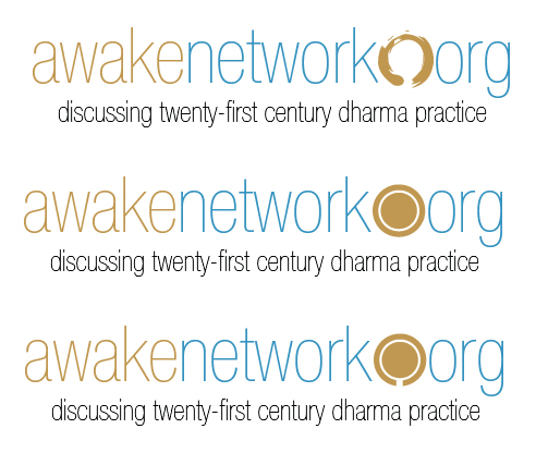
Since Andy mentioned it elsewhere, it made sense to spin this off into a separate topic because Russell and I have been chatting about it. He made the suggestion that we make up AwakeNetwork t-shirts for the BG conference. The sticking point is the lack of a logo, but personally, I think it would be totally fine to just use the two-tone script-y name that is on the site header. Then, we could have several variants of subtext, including:
Thoughts? Sources? Russell mentioned CafePress but I am not sure what Andy used.
- discussing 21st century dharma practice
- I am experiencing things at precisely the rate that I need to experience them, no more, no less.
- ...
Thoughts? Sources? Russell mentioned CafePress but I am not sure what Andy used.
-- tomo
13 years 1 month ago #12559
by Russell
Replied by Russell on topic Been there, done that, got the t-shirt
As we were discussing in Tom's thread. Anyone up for some AN t-shirts? Especially for those going to the BG conference? We need a logo, and I know this has been discussed before, but does anyone have time to do some mockups?
13 years 1 month ago - 13 years 1 month ago #12561
by Russell
Replied by Russell on topic Been there, done that, got the t-shirt
First stab. Man....it's all coming out very 'Apple'esque these days... and yes the 'awaken' (instead of just awake) was meant to be that way...

Last edit: 13 years 1 month ago by Russell.
13 years 1 month ago #12562
by Tom Otvos
-- tomo
Replied by Tom Otvos on topic Been there, done that, got the t-shirt
I am a little reluctant to reopen the logo discussion, because while I know it can't be perfect, I think it requires careful thought that I can't afford right now. We did settle on what we have with some bit of voting, and some heavy-handedness on my part. I am mostly afraid for people to spend a bunch of their time on something that simply doesn't resonate with me.
All that said, there is a "je ne sais quoi" about what you have Russell that I kind of like. Yes, going Helvetica Neue is very Apple-esque...I think you have iOS 7 on the brain. But part of me likes jumping on that bandwagon before iOS comes out, for an extra bit of familiarity. I strong dislike your changing the "n" because it invites misspelling when said out loud as it begs "nn". And I really like the dot image, kind of a Helvetica Neue enso. Lastly, I am kind of partial to our current colours, and so I would revert to those, and then the enso would probably be in the blue. The grey would not show up particularly well on a grey shirt, for example so while the subtext colour can change, the core logo should probably be using "t-shirt safe" colours.
I know you said (privately) that you spent all of a minute on that. So if you wanted to invest another minute tweaking it...?
-- tomo
13 years 1 month ago #12563
by Russell

Replied by Russell on topic Been there, done that, got the t-shirt
13 years 1 month ago #12565
by Russell
Replied by Russell on topic Been there, done that, got the t-shirt
Sorry...colors...
13 years 1 month ago - 13 years 1 month ago #12568
by Tina
Replied by Tina on topic Been there, done that, got the t-shirt
I think the design ideas you have so far are great!
Sign me up for one, even though I'm not going to the BG conference!
Sign me up for one, even though I'm not going to the BG conference!
Last edit: 13 years 1 month ago by Tina. Reason: clarity
13 years 1 month ago - 13 years 1 month ago #12576
by nadav
Replied by nadav on topic Been there, done that, got the t-shirt
Cool. I personally prefer the enso to the volume knob, for what it's worth.
*EDIT*: Well, maybe not that particular enso, but I like the idea.
*EDIT*: Well, maybe not that particular enso, but I like the idea.
Last edit: 13 years 1 month ago by nadav.
13 years 1 month ago #12577
by Rod
Replied by Rod on topic Been there, done that, got the t-shirt
I like the Enso version too but without the words underneath. Just the logo
13 years 1 month ago - 13 years 1 month ago #12578
by Russell
Replied by Russell on topic Been there, done that, got the t-shirt
This is all Tom's call, I am just screwing around in Adobe Illustrator. What about removing the ORG?

Last edit: 13 years 1 month ago by Russell.
13 years 1 month ago #12579
by nadav
Replied by nadav on topic Been there, done that, got the t-shirt
You could use the enso as the "o" in network, in that case.
13 years 1 month ago #12581
by Rod
Replied by Rod on topic Been there, done that, got the t-shirt
Good idea
13 years 1 month ago #12587
by Colleayn
Replied by Colleayn on topic Been there, done that, got the t-shirt
Thumbs up.
13 years 1 month ago #12589
by Tom Otvos
...to...?
-- tomo
Replied by Tom Otvos on topic Been there, done that, got the t-shirt
Colleayn wrote: Thumbs up.
...to...?
-- tomo
13 years 1 month ago - 13 years 1 month ago #12590
by Colleayn
Replied by Colleayn on topic Been there, done that, got the t-shirt
Yes, two thumbs up. But put it on something shapely, for a woman. I don't want to schlep around in a men's XL, big boxcar of a shirt.
Picky, picky. I know. It's always been a pet peeve. Logo t-shirts are ALWAYS only in men's sizes. I'll buy the Marie Farlio version. Thank you very much.
Picky, picky. I know. It's always been a pet peeve. Logo t-shirts are ALWAYS only in men's sizes. I'll buy the Marie Farlio version. Thank you very much.
Last edit: 13 years 1 month ago by Colleayn.
13 years 1 month ago #12596
by Tom Otvos
Oh, I misunderstood. I thought you were offering a vote on one of the possible logos. I think we might be going with more of a self-serve approach for shirts where you can order your own from a given set of designs. Still early planning stages, though.
-- tomo
Replied by Tom Otvos on topic Been there, done that, got the t-shirt
Colleayn wrote: Yes, two thumbs up. But put it on something shapely, for a woman. I don't want to schlep around in a men's XL, big boxcar of a shirt.
Picky, picky. I know. It's always been a pet peeve. Logo t-shirts are ALWAYS only in men's sizes. I'll buy the Marie Farlio version. Thank you very much.
Oh, I misunderstood. I thought you were offering a vote on one of the possible logos. I think we might be going with more of a self-serve approach for shirts where you can order your own from a given set of designs. Still early planning stages, though.
-- tomo
13 years 1 month ago #12602
by Russell
Replied by Russell on topic Been there, done that, got the t-shirt
Nadav's idea. I like this too.

13 years 1 month ago #12605
by Andy
+1
Replied by Andy on topic Been there, done that, got the t-shirt
Russell wrote: Nadav's idea. I like this too.
+1
13 years 1 month ago #12607
by Shargrol
Replied by Shargrol on topic Been there, done that, got the t-shirt
I'm seeing a lot of people add the on/off (O with a vertical "I" through the circle) in place of the letter o. Could be the (ugh) enso for the o in network and could be the on/off for the o in org.
13 years 1 month ago - 13 years 1 month ago #12611
by Rod
Replied by Rod on topic Been there, done that, got the t-shirt
I like this design/form too. I would wear this anytime, anywhere......except at a bedding store 
Last edit: 13 years 1 month ago by Rod.
13 years 1 month ago #12613
by Colleayn
Replied by Colleayn on topic Been there, done that, got the t-shirt
I got that. Made an attempt at B.S.ing with you.
12 years 11 months ago #13964
by Tom Otvos
-- tomo
Replied by Tom Otvos on topic Been there, done that, got the t-shirt
As the conference is fast approaching, I realized that this ball had been dropped. Thanks to some quick footwork on Russell's part, I think we can get some shirts done for the conference, so I am now canvassing for explicit interest in a shirt. This will enable a bulk discount, plus spreading the shipping across multiple shirts, so it would be a saving to you. Of course, those not going can order a shirt for themselves, but right now I just want to know firm numbers for the conference. Here is the shirt as it stands:
www.cafepress.com/cp/customize/product2.aspx?number=903857166
Now, this is just the men's shirt. We will do a ladies design as well. Honestly, I am not sure how the bulk discount works exactly when we are mixing and matching men's, ladies, and shirts of different sizes. Once I have numbers, and sizes, I can explore that. Please let me know ASAP.
-- tomo
Less
More
- Posts: 6503
- Karma: 2
12 years 11 months ago #13972
by Chris Marti
Replied by Chris Marti on topic Been there, done that, got the t-shirt
Okay, I've changed my mind, Tom. I'm good for two, XL.
12 years 11 months ago #13974
by Russell
Replied by Russell on topic Been there, done that, got the t-shirt
1 L for me.
Less
More
- Posts: 1570
12 years 11 months ago #13975
by Laurel Carrington
Replied by Laurel Carrington on topic Been there, done that, got the t-shirt
I will take a size large.